Go beyond the ordinary with Planet Destinations luxury travel website.
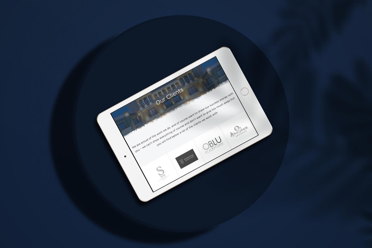
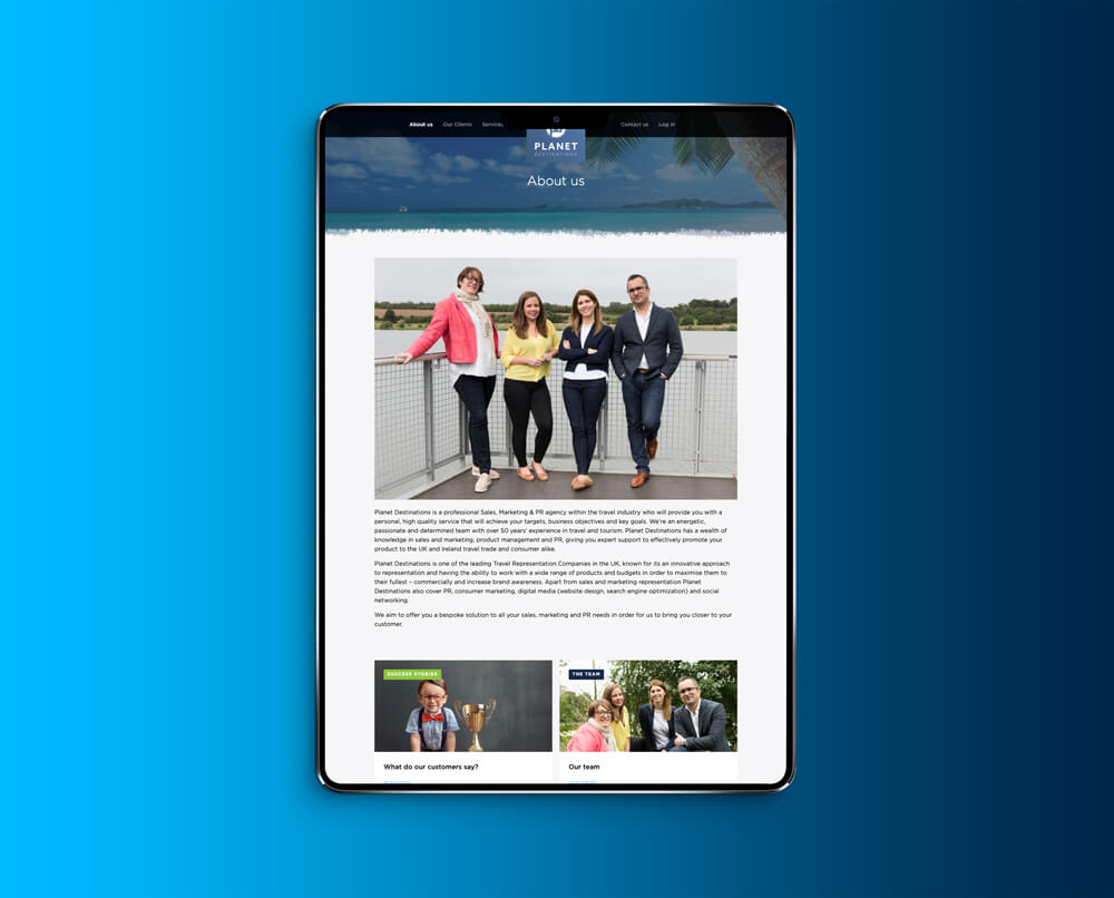
Planet Destinations is one of the leading Travel Representation Companies in the UK, known for its an innovative approach to representation and having the ability to work with a wide range of products and budgets in order to maximise them to their fullest – commercially and increase brand awareness. Apart from sales and marketing representation Planet Destinations also cover PR, consumer marketing, digital media (website design, search engine optimisation) and social networking.
The aim was to portray that Planet Destinations are a modern, bespoke, creative Travel Representation Company.
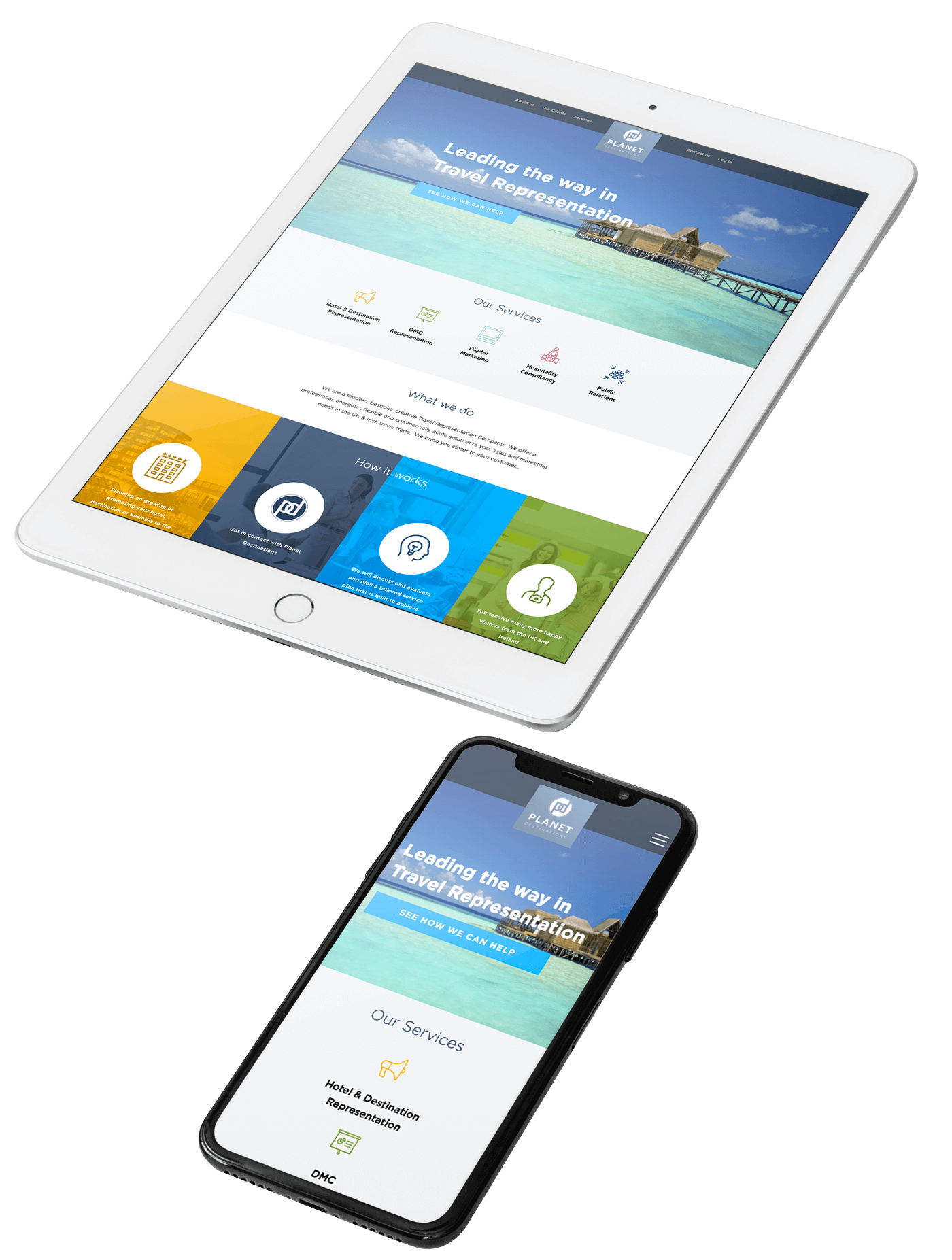
We constructed a platform that showcased their full offering putting emphasis on their professional, energetic, flexible and commercially acute solution offering sales and marketing needs in the UK & Irish travel trade.
Carefully We bring you closer to your customer
The ideal visitability experience includes a mix of location and destination specific content, and a blend of editorial and curated articles and recommendations.
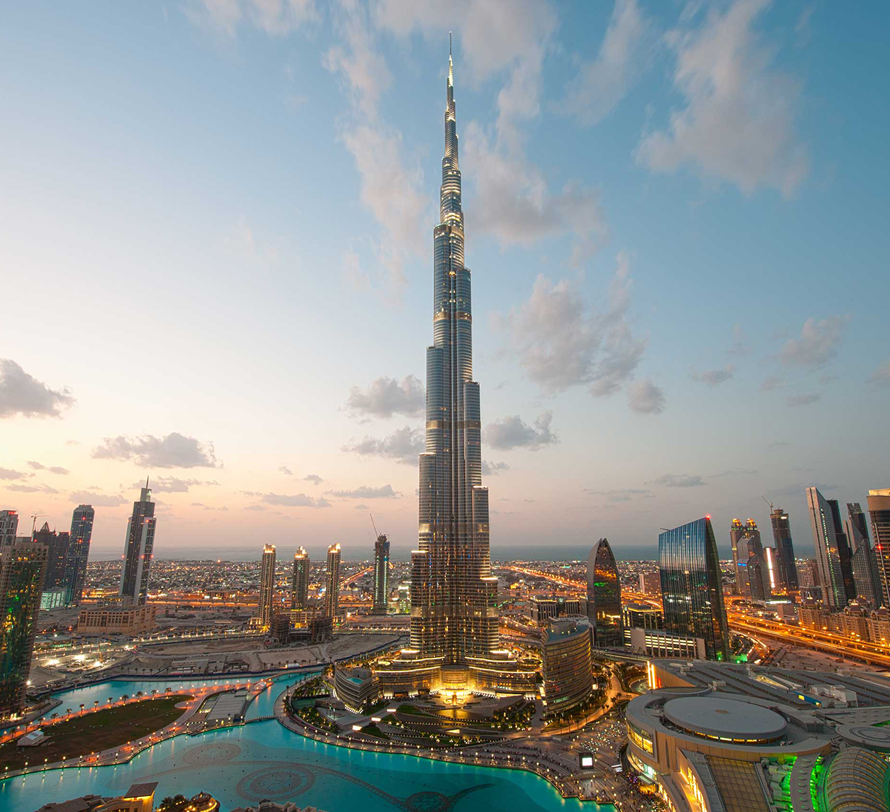
High-quality photography is also critical, transporting the viewer to a location and eliciting a “must-see” response. The site layout prominently features high-resolution, colourful imagery that showcases a strategic assortment of the worlds musts and lesser known traditional gems. A bold, diagonal motif carries a high-energy visual language throughout the design.
Because the finished product is geared specifically to travel companions, Planet Destinations visitability site is not crawled by search engines so much nor is that a core ambition for the platform.
Although, we did set the team up with a sophisticated technology platform to allow them to simultaneously capture and explore customer data insights, giving the ability to shape future content or features within the content management system.

Fixed websites have a set width, and resizing the browser or viewing it on different devices won’t affect on the way the website looks. This can require horizontal scrolling and a site that doesn’t look good on tablets or smartphones.
Fluid websites are built using percentages for widths. As a result, columns are relative to one another and the browser, allowing it to scale up and down fluidly.
Adaptive websites introduce media queries to target specific device sizes, like smaller monitors, tablets, and mobile.
Responsive websites are built on a fluid grid and use media queries to control the design and its content as it scales down or up with the browser or device.
After re-focussing our business’ look and feel, we needed a website that reflected our modern take on Luxury Travel. Our requirements were unique so a typical cookie-cutter website wasn’t going to cut it. Slot Digital analysed our requirements in detail and designed/implemented a new website which exceeded our expectations. It was done on time and on budget. The entire process was diligently managed to ensure the desired outcome. I cannot fault any aspect of the process or outcome.